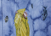
Today I experimented with painting directly from *gasp* my imagination, without using any visual references. Scary! Sky diving without a parachute kind of scary. Only, as it turns out, you can't actually die from painting without reference material. It was uncomfortable at first, but in the end I came up with this princess:

I'm currently in the middle of an all-consuming experimentation binge. I think that's one reason my blog posts have been so sparse lately. I'm working with so many new techniques, pushing so hard and so far outside of my comfort zone, that I've turned into a great big slacker when it's time to articulate the day's discoveries. In any case, this princess is my first attempt at developing a lighter, more whimsical style. Another tool for the toolbox. I kept changing the color of her dress, and things got a bit muddy, but she turned out pretty close to what I had in mind.
Today's most significant discovery was this: sometimes less is....less. When I began painting this study, I had a very clear image in my mind of the face and the expression that I wanted to create, and I had an easy time rendering it the way that I wanted. The hair seemed to emerge naturally as well. But when I got to the dress I began to struggle. The skirt looked wrong. I thought I'd exaggerated the proportion too much, and I tried moving back toward realism by making the skirt smaller. But that looked worse. So I tried making it absurdly full and poufy. And lo' making it more wrong made it look right. I'm really looking forward to exploring the space around the figure. I suspect that this wrong=right principle will come into play there as well.


2 comments:
Deep down, you know that big and poufy is the way to go.
So what's the next wrong way to start an image? Do you paint the bodies first and then paint the dress over it? Or the dress first?
I think she is quite beautiful!
Post a Comment